Blended Sense Onboarding and Personalization
Project Brief
Improve the current onboarding process for creatives and Content Producers by building an efficient and comprehensive experience.
Role
I was the Product Designer for the project in charge of UX strategy and design. Our team consisted of a Design Lead, Graphic Designer, and over seas development team.
Team
Myself, Patrick Ramos, Masha Ploshchadina
Project MVP launched in July 2022.
.png)
The Company


A New Kind of Production
Blended Sense is a subscription based service company, where all the pre and post media production happens on a platform, including the matching of creatives run by an internal producer, who acts as the creative liaison between the small business owner and the network of curated creative professionals.
Research
To better understand what our team needed to know before accepting or declining a creative into the network, I interviewed 3 Content Producers and sent out a survey to 10 of our creatives.
Insights & Key Takeaways
-
Content Producers want to know what other languages the creative is able to speak so they can better match them to servicing multilingual customers.
-
Application questions are different for every user type (Photographer/Videographer, Talent and Field Producer) and should ask in-depth detail about what they are able to do/ equipment they have available to them.
-
Content Producers need to know what a creatives work availability looks like straight away, rather than having to wait weeks after they've applied.
-
Creatives need to provide the distance they are willing to travel, mode of transportation, and how often they want to work.
-
Creatives need to know how long the application will take them, how long till they learn if they got accepted, and what to do if they get accepted.
-
Giving customers and creatives two separate screens for login and sign up is less confusing for the user during the sign up process.
Problem Areas
1
Onboarding not collecting enough information
As a result, our content producers waste time reaching out to applicants for more information, rather than having context given to them from the applicant's initial submission.
With more data being collected from our creative network, the better we can understand who our users are and make greater research backed business level decisions.

2
Lack of communication
Before starting their application, creatives are not being given any background on what the process is, what to expect after completion, and how long it takes to hear back from our team. This results in creatives reaching out to our team unsure about their status or not checking their status at all.

Copy and design give mixed signals to user, causing confusion and uncertainty towards the creative network- before they have even been accepted.
3
Sign up confusion
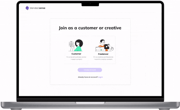
Customers and Creatives signed up with their email and password on the same screen, and chose their user type at the beginning of the sign up flow. This resulted in customers and creatives selecting the wrong user types and causing the internal team to spend time fixing the error, while delaying the customer getting serviced.
![MacBook_Pro_-_4[1].png](https://static.wixstatic.com/media/cfb83d_1541d621a40b4dd5b691432ee1402ff7~mv2.png/v1/crop/x_501,y_29,w_584,h_913/fill/w_140,h_219,al_c,q_85,usm_0.66_1.00_0.01,enc_avif,quality_auto/MacBook_Pro_-_4%5B1%5D.png)
![Frame_26[1].png](https://static.wixstatic.com/media/cfb83d_fc6709f00efb4480b12cfc0e3d340f07~mv2.png/v1/fill/w_267,h_219,al_c,q_85,usm_0.66_1.00_0.01,enc_avif,quality_auto/Frame_26%5B1%5D.png)

Once an option is selected, the user can't go back and change their user type.

Collect research from content producers and use that information to add more questions to the creative application.
The Approach

Add more background to the beginning and end of the application process.

Change the user flow by creating a new way of signing up as a customer or creative.
Planning
With these insights, I mapped out a swim lane user flow showing how the Creative Community Builder and Creative would interact with the UI and System. With so many moving parts in the project, I wanted to get an in depth look at how these three solutions fit together. I was able to use this blueprint as a way to receive feedback and improve the flow from our Content Producers, Internal Leadership and the Product Team.

Check out the in depth swim lane user flow HERE.
Designs
In a survey sent out to creatives, it was shown that it was a 50% split with users who use mobile or desktop while filling out there application. While designing I used this information to make sure I created components that were flexible for both desktop and mobile.
Added more questions to learn more about the creative, dependent on what creative type they choose.
Used new branding styles to update the look and feel of the Blended Sense brand.
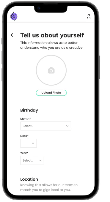
Mobile optimized the application process to meet the creative users needs.
An introduction screen was created to inform the creative applying what the overall process looked like, and a submission confirmation screen was created to give context to when they would hear back.
Intro Screen

New design shows the creative what the Blended Sense process looks like.
Prepares the user on how much time will be needed to complete the application.
Submission Confirmation Screen

Submission screen gives confirmation and sets expectation on how long the determination process is.
I also created new dashboard designs that the creative arrives to after they are waiting to hear back, have been accepted or rejected into the network.
Pending Dashboard
.png)
Clear copy about where the creative is in the determination process.
Links to resources from Blended Sense that the user can visit while they wait.
FAQS created from research survey results.
Active Dashboard

Events section that shows upcoming productions that the creative has accepted an invitation to.
Tasks section that shows actionable tasks that need to be completed.
Questions that Content Producers get asked about frequently.
Resources provided by Blended Sense that help the creative.
Rejection Dashboard
.png)
Clear copy letting the applicant that they were not accepted, but can apply again at a later time.
FAQ that let's the applicant know when they can apply again.
With the onboarding flow and dashboards in place, we now needed sign up screen designs for the creative and customer in order to represent the new point of entry. In an effort to stop users from signing up for the wrong account, we added an initial screen that asks the user to verify what they are joining us for.
Takeaways
I learned a lot through this project. Through this process of leading a product design project, I learned how to communicate with leadership team and navigate through design ideas and decisions- especially with the project starting while we were doing a brand redesign.
Working on this platform also taught me how essential/important user research is. I experienced actively applying the things our team learned to the choices we made on user experience and interaction patterns.
Additionally, our team worked with developers for this project, which gave me the experience of working with real, technical constraints. I learned how to effectively communicate to help implementation go smoothly.